Colors For The Colorblind
Just as most "blind" people are not completely blind, most people who have deficient color perception are not completely "colorblind". Hence, we hesitate to use the adjective, in favor of the more scientifically correct color-deficient or dyschromatopic. Regardlessly, the percentage of the population afflicted by this condition makes the problem non-trivial:
             Causasian   Asiatic     Others
       Male  8.0%        5.0%        3.0%
     Female  0.5%        0.5%        0.5%
Normal color perception is trichromatic, i.e., consisting of the three primary colors of light (red, green and blue). Six general types of dyschromatopsia have been identified. People with complete colorblindness, a rare retinal defect affecting the cones of 0.003% of caucasian males, are achromatic, also known as monochromatic. People with partial colorblindness are either dichromatic or anonamlously trichromatic.
Dichromatic people are missing one of the color-sensitive photopigments in retinal cones, usually an inherited genetic condition. For example, when either the red- or green-sensitive pigment is missing, reds and greens are unable to be distinguished. Specifically, there are three kinds of dichromatic colorblindness, presented here with the percentages for caucasian males [1]:
    Protanopia missing red-sensitive pigment:  1.0%
Deuteranopia missing green-sensitive pigment:  1.1%
   Tritanopia missing blue-sensitive pigment:  0.001%
Anomalously trichromatic people have all three pigments, but one or more may be abnormal. This condition is more common than being dichromatic, accounting for nearly 6 of the 8% of caucasian males who are colorblind:
      Protanomalous abnormal red sensitivity:  1.0%
  Deuteranomalous abnormal green sensitivity:  4.9%
Factors that determine color perception include:
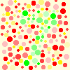
Note that the hue is confused by color-deficient people. Hence, if the hues involved are the same value and saturation, there is no visual clue to distinguish them. (This is the principle on which the familiar Ishihara colorblind tests are based.) We speculate that low-saturation (or "greyish") colors of the same value are hardest to distinguish, because any residual ability to distinguish hue is diminished, and in the case of red-green confusion, the greyed or washed out color contains both hues, which are complementary.
Consequently, where color differentiation is critical the overall rule of thumb is to use colors that contrast in value or intensity. This will even work for monochomatics, who see the world in shades of grey from black to white. We can easily test the effectiveness of this for computer-generated graphics, as many computer graphics tools have options to view imagery as a greyscale. In addition we can apply the principle of redundance by differing the colored areas in texture, shape or other visual clues to reinforce the message.
For dichromatic and anomalously trichromatic people we can further consider the color shift resulting from the missing or abnormal pigment -- again, especially if color value and saturation are the same. For examle, red-green deficiency causes color confusion other than one against the other, such as green foliage against a red wall.
People with missing or abnormal red photopigments (2% of caucasian males) have difficulty discriminating:
People with deficient or missing green pigments (6% of caucasian males, the largest group) have difficulty discriminating:
Also be aware that it is more difficult to distinguish dark (low value) and/or saturated colors (e.g., a 16-color palette blue or red against black), and extremely light pastels, particularly in low or bright light conditions. This is especially true for the colorblind.
As discussed in Colors In Context, the color perception changes depending upon background and adjacent colors, but how these changes affect colorblind people may be hard to anticipate. For example, one color-deficient person reports that an orange object may look orange in a beige field, but actually appear green in a red field!
Where colors must convey different messages use those that are easily distinguished by colorblind persons. Generally this means using colors that contrast in value, intensity, luminance or tint (light/dark), and saturation, chroma or shade (vividness), and employing redundant visual clues such as texture and shape, rather than relying on hue alone. As most dychromatopes are red-green deficient, especially avoid palettes that only vary in these hues, such as dark or light green, red and brown.
